Difference between revisions of "InfoWindow Class"
Jump to navigation
Jump to search
| (6 intermediate revisions by 2 users not shown) | |||
| Line 1: | Line 1: | ||
| − | ==Introduction== | + | == Introduction == |
| − | This guide describes the ReAction compatible ''' | + | This guide describes the ReAction-compatible '''information window class''' for users and developers. |
| + | The '''InfoWindow Class''' (installed as ''infowindow.class'' in the SYS:Classes/ directory) is a BOOPSI-compliant class that is used to display information windows such as About-windows commonly found in many applications. | ||
| − | + | From developers' perspective, it provides an easy and adaptable way of creating and presenting information windows within their application. The class is highly configurable to suit many different needs and scenarios. | |
| − | + | == Version == | |
| + | The latest version is 53.8 available in the [[Enhancer Software]] for both AmigaOS3 and AmigaOS4. | ||
| − | ==Features== | + | == Features == |
| + | The features include: | ||
| + | * Formatted text | ||
| − | ==Screenshots== | + | * Aligned images |
| + | |||
| + | * Configurable panel featuring tabs, a configurable text field or a custom BOOPSI gadget | ||
| + | |||
| + | * Configurable button row supporting any number of buttons, and a timeout feature. | ||
| + | |||
| + | |||
| + | == Screenshots == | ||
<center> | <center> | ||
| Line 39: | Line 50: | ||
</center> | </center> | ||
| − | |||
| + | == For Developers == | ||
| + | |||
| + | === Autodoc === | ||
<pre> | <pre> | ||
| − | + | infowindow.class/--datasheet-- | |
| − | |||
| − | |||
| − | |||
| − | |||
| − | |||
| − | |||
| − | infowindow.class/--datasheet-- | ||
NAME | NAME | ||
| Line 58: | Line 64: | ||
REQUIRES | REQUIRES | ||
| − | bitmap.image, button | + | bitmap.image, button.gadget, clicktab.gadget, label.image, layout.gadget, |
| − | + | scroller.gadget, texteditor.gadget, tickbox.gadget, window.class | |
| − | |||
DESCRIPTION | DESCRIPTION | ||
| Line 75: | Line 80: | ||
- optional checkbox gadget for confirming information | - optional checkbox gadget for confirming information | ||
- keyboard control | - keyboard control | ||
| − | - timeout | + | - timeout (with an optional counter) |
The class does not replace the Requester Class but it can be seen as | The class does not replace the Requester Class but it can be seen as | ||
| Line 103: | Line 108: | ||
ATTRIBUTES | ATTRIBUTES | ||
| − | The infowindow is | + | The infowindow is designed as a modal (i.e. blocking) requester, so all of |
| − | attributes can only be set or retrieved when the window is NOT open. | + | its attributes can only be set or retrieved when the window is NOT open. |
Use SetAttrs() freely in between individual IWM_OPEN calls to re-configure | Use SetAttrs() freely in between individual IWM_OPEN calls to re-configure | ||
| Line 208: | Line 213: | ||
Applicability is (OM_NEW, OM_SET, OM_GET) | Applicability is (OM_NEW, OM_SET, OM_GET) | ||
| + | |||
| + | INFOWINDOW_CheckBoxPlace (uint32) | ||
| + | The placement of the optional checkbox gadget within the infowindow. | ||
| + | Possible values are PLACECHECK_LEFT, PLACECHECK_RIGHT and | ||
| + | PLACECHECK_CENTER. The checkbox text label will be displayed to the | ||
| + | right of the gadget unless PLACECHECK_RIGHT is set (in which case the | ||
| + | text will show on the left). | ||
| + | |||
| + | Defaults to PLACECHECK_LEFT | ||
| + | |||
| + | Applicability is (OM_NEW, OM_SET) | ||
INFOWINDOW_Checked (BOOL) | INFOWINDOW_Checked (BOOL) | ||
| Line 291: | Line 307: | ||
This tag will be ignored if there is no body text. | This tag will be ignored if there is no body text. | ||
| − | + | Defaults to PLACEIMAGE_LEFT | |
Applicability is (OM_NEW, OM_SET) | Applicability is (OM_NEW, OM_SET) | ||
| Line 366: | Line 382: | ||
standard text field. | standard text field. | ||
| − | The tab panel's text fields are currently rendered using | + | The tab panel's text fields are currently rendered using a read-only |
| − | Gadget. This may change in the future. | + | TextEditor Gadget. This may change in the future so don't assume |
| + | anything about the formatting of the text. | ||
Defaults to NULL (no panel) | Defaults to NULL (no panel) | ||
| Line 373: | Line 390: | ||
Applicability is (OM_NEW, OM_SET) | Applicability is (OM_NEW, OM_SET) | ||
| − | |||
| − | |||
| − | |||
| − | |||
| − | |||
| − | |||
| − | |||
| − | |||
| − | |||
| − | |||
| − | |||
| − | |||
| − | |||
| − | |||
| − | |||
| − | |||
| − | |||
| − | |||
| − | |||
| − | |||
| − | |||
| − | |||
| − | |||
| − | |||
| − | |||
| − | |||
| − | |||
| − | |||
| − | |||
| − | |||
| − | |||
| − | |||
| − | |||
| − | |||
| − | |||
| − | |||
| − | |||
| − | |||
| − | |||
| − | |||
| − | |||
| − | |||
| − | |||
| − | |||
| − | |||
| − | |||
| − | |||
| − | |||
</pre> | </pre> | ||
Revision as of 12:37, 3 July 2018
Introduction
This guide describes the ReAction-compatible information window class for users and developers.
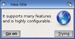
The InfoWindow Class (installed as infowindow.class in the SYS:Classes/ directory) is a BOOPSI-compliant class that is used to display information windows such as About-windows commonly found in many applications.
From developers' perspective, it provides an easy and adaptable way of creating and presenting information windows within their application. The class is highly configurable to suit many different needs and scenarios.
Version
The latest version is 53.8 available in the Enhancer Software for both AmigaOS3 and AmigaOS4.
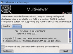
Features
The features include:
- Formatted text
- Aligned images
- Configurable panel featuring tabs, a configurable text field or a custom BOOPSI gadget
- Configurable button row supporting any number of buttons, and a timeout feature.
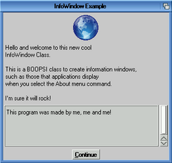
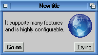
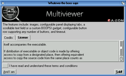
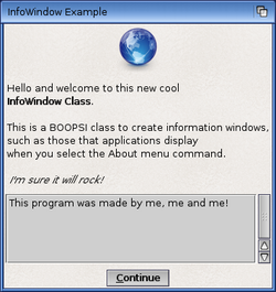
Screenshots
|
OS3 version |
OS3 version |
OS3 version |
|
OS4 version |
OS4 version |
OS4 version |
For Developers
Autodoc
infowindow.class/--datasheet--

  NAME
    infowindow.class -- Create an information window

  SUPERCLASS
    window.class

  REQUIRES
    bitmap.image, button.gadget, clicktab.gadget, label.image, layout.gadget,
    scroller.gadget, texteditor.gadget, tickbox.gadget, window.class

  DESCRIPTION
    This is a BOOPSI class to create information windows, such as those that
    applications display when you select the "About" menu command.

    Supported features:

    - formatted text
    - image with configurable placement and backfill
    - configurable panel to display tabs, a scrollable text field, or a custom
      BOOPSI gadget (e.g. a listbrowser)
    - configurable button row supporting any number of buttons
    - optional checkbox gadget for confirming information
    - keyboard control
    - timeout (with an optional counter)

    The class does not replace the Requester Class but it can be seen as
    a more sophisticated version of the REQTYPE_INFO requester type.

  METHODS
    OM_NEW -- creates the infowindow object, sets attributes and defaults

    OM_SET -- sets object attributes (passed to the superclass first)

    OM_GET -- retrieves object attributes (passed to the superclass first)

    OM_DISPOSE -- disposes of the infowindow object

    IWM_OPEN -- opens the infowindow

  KEYBOARD CONTROL
    Escape
      Cancels the infowindow (IWM_OPEN returns IWMRES_CANCEL).

    Return / Enter
      Selects the default choice and closes the infowindow (IWM_OPEN returns
      the number of the button).

    Cursor Left / Right
      Switches between tabs (if the tab panel is displayed).

  ATTRIBUTES
    The infowindow is designed as a modal (i.e. blocking) requester, so all of
    its attributes can only be set or retrieved when the window is NOT open.

    Use SetAttrs() freely in between individual IWM_OPEN calls to re-configure
    the infowindow: no need to dispose of and rebuild the object if you want
    to change the look, contents or behaviour of the window.

    SetAttrs() will return the number of attributes set.

    The InfoWindow Class is based on the Window Class, so many attributes
    supported by the superclass are applicable. Use them wisely: make sure
    you don't turn the infowindow into something it's not supposed to be.

    The following superclass attributes are explicitly IGNORED because their
    (mis)use could compromise the look or functioning of the infowindow:

    WA_Backdrop
    WA_BackFill
    WA_Borderless
    WA_Hidden
    WINDOW_AppPort
    WINDOW_AppWindow
    WINDOW_Iconifiable
    WINDOW_IconifyGadget
    WINDOW_IDCMPHook
    WINDOW_InputEvent
    WINDOW_MenuStrip
    WINDOW_NewMenu
    WINDOW_PopupGadget

    Further notes on the use of superclass attributes:

    WA_Width and WA_Height are treated as WA_InnerWidth and WA_InnerHeight,
    respectively. This behaviour is inherited from the Window Class.

    If WA_CloseGadget is provided and set to TRUE, the IWM_OPEN method will
    return the value of IWMRES_CANCEL if the window was closed (= cancelled)
    via the close gadget. The Escape key shortcut has an identical function
    (and result value) but it is available at all times, regardless of the
    WA_CloseGadget setting.

    The class needs to be able to resolve the screen on which the infowindow
    will open. The following policy is applied here:
    - If INFOWINDOW_Parent is set, the class will attempt to obtain the screen
      pointer from the parent window object (the window needs to be open for
      this to work);
    - the WA_CustomScreen, WA_PubScreen and WA_PubScreenName tags are next in
      preference, respectively;
    - if there is no tag setting allowing to resolve the screen, it is assumed
      that opening on the default public screen is requested.

    You might prefer setting INFOWINDOW_Parent over the Intuition screen tags.
    This way the infowindow will always stay with your program window, which
    is especially useful if your application supports jumping between screens.
    Otherwise you'd have to update the infowindow with a new screen pointer
    whenever the application changes screen.

    The InfoWindow Class' own attributes are described below:

    INFOWINDOW_Parent (Object *)
      A pointer to a window object that will be the "parent" of the
      information window. Often the parent is the application's main window.
      The class will automatically set the busy pointer for the parent,
      blocking its input while the infowindow is open.

      Applicability is (OM_NEW, OM_SET)

    INFOWINDOW_BodyText (CONST_STRPTR)
      Text for the body of the information window.

      The following codes can be used within the provided string to change
      the soft style of the text:

      ESC u -- underline
      ESC b -- bold
      ESC i -- italic
      ESC n -- normal

      Example string: "The following words \33bare in bold\33n."

      Defaults to NULL

      Applicability is (OM_NEW, OM_SET, OM_GET)

    INFOWINDOW_GadgetText (CONST_STRPTR)
      Text for the information window's button(s), delimited by the vertical
      bar character (|) if you want more than one button (e.g. "Yes|No").

      Defaults to "_OK"

      Applicability is (OM_NEW, OM_SET, OM_GET)

    INFOWINDOW_CheckBoxText (CONST_STRPTR)
      If you provide this text string, the class will display a checkbox
      gadget at the bottom of the information window. The string will become
      the gadget's label.

      One obvious purpose of the checkbox is to allow the user to confirm the
      information displayed in the window before closing it and proceeding.
      The state of the gadget upon closing the infowindow can be retrieved
      via the INFOWINDOW_Checked tag; see below.

      Defaults to NULL (no checkbox will be displayed)

      Applicability is (OM_NEW, OM_SET, OM_GET)

    INFOWINDOW_CheckBoxPlace (uint32)
      The placement of the optional checkbox gadget within the infowindow.
      Possible values are PLACECHECK_LEFT, PLACECHECK_RIGHT and
      PLACECHECK_CENTER. The checkbox text label will be displayed to the
      right of the gadget unless PLACECHECK_RIGHT is set (in which case the
      text will show on the left).

      Defaults to PLACECHECK_LEFT

      Applicability is (OM_NEW, OM_SET)

    INFOWINDOW_Checked (BOOL)
      Setting this attribute will make the checkbox selected or unselected
      when the infowindow next opens. GetAttrs() can be used to retrieve the
      state of the gadget upon closing the window.

      Please note that the class stores the checkbox state regardless of
      whether the infowindow was OK'ed, cancelled, or timed out. You'll want
      to also check the IWM_OPEN method return value to distinguish between
      these situations.

      Defaults to FALSE

      Applicability is (OM_NEW, OM_SET, OM_GET)

    INFOWINDOW_Justification (uint16)
      Body text justification. Applicable values are LJ_LEFT, LJ_CENTER
      or LJ_RIGHT.

      Defaults to LJ_LEFT (left-justified)

      Applicability is (OM_NEW, OM_SET)

    INFOWINDOW_WrapBorder (uint16)
      If the body text does not contain any linefeeds (\n) it will be
      word-wrapped automatically after the number of characters specified
      in this tag.

      Defaults to 0 (no word-wrap)

      Applicability is (OM_NEW, OM_SET)

    INFOWINDOW_DefButton (uint32)
      Specifies the default, highlighted button. If the Return or Enter key is
      pressed, the infowindow will close as if this button has been selected.
      A value of 0 means there is no default button, and the Return/Enter
      keyboard shortcut will not be available.

      Defaults to 1 (the first button from the left)

      Applicability is (OM_NEW, OM_SET)

    INFOWINDOW_Image (Object *)
      A custom BOOPSI image object to display in the information window. Note
      that the image will not be disposed of by the class, you need to take
      care of this yourself (the logic here is: "you create the image, you
      dispose of it").

      This tag takes precedence over INFOWINDOW_ImageFile (see below).

      If your application supports jumping between different screens, it might
      be necessary to rebuild your custom image object for the particular new
      host screen, to ensure the image is rendered with proper colours. This
      will be the case when jumping between an 8-bit screen and a 16/32-bit
      screen, or vice versa.

      Defaults to NULL

      Applicability is (OM_NEW, OM_SET, OM_GET)

    INFOWINDOW_ImageFile (CONST_STRPTR)
      A name of a source file from which the class will create a BOOPSI image
      to display in the information window. The file can be in any picture
      format supported by DataTypes. The image object created this way is
      stored internally and the class will dispose of it automatically.

      This tag will be ignored if INFOWINDOW_Image is provided (see above).

      Defaults to NULL

      Applicability is (OM_NEW, OM_SET)

    INFOWINDOW_ImagePlace (uint32)
      Flags to determine the placement of the image with regard to the body
      text. The image can be placed on the left (default), on the right,
      above or below the text. When PLACEIMAGE_ABOVE or PLACEIMAGE_BELOW is
      set, the image will be center-aligned horizontally unless you also set
      PLACEIMAGE_LEFT or PLACEIMAGE_RIGHT (for example, setting this tag to
      the combination of PLACEIMAGE_ABOVE|PLACEIMAGE_LEFT will display the
      image in the top-left corner above the body text).

      This tag will be ignored if there is no body text.

Defaults to PLACEIMAGE_LEFT

      Applicability is (OM_NEW, OM_SET)

    INFOWINDOW_ImageBackFill (struct Hook *)
      Sometimes it may be desirable to place the image on a filled background.
      This tag allows providing a backfill hook for this purpose.

      Defaults to NULL

      Applicability is (OM_NEW, OM_SET)

    INFOWINDOW_TabPanel (struct InfoWindowTab *)
      Use this tag to configure a special panel for displaying additional
      information in the window. This will normally be a tabbed panel with
      scrollable text fields but other configurations are also possible.

      The tabbed panel is created by passing an array of struct InfoWindowTab
      (see <classes/infowindow.h> for definition). The Label member of each
      structure in the array must contain the tab label string. The actual
      contents of the Data member may vary depending on the Type member value:

      TABDATA_STRING -- Data contains a text string
      TABDATA_FILE   -- Data contains a name of a text file
      TABDATA_LOCK   -- Data contains a DOS lock on a text file

      This means that information to be displayed in the panel can be placed
      externally. For example, you can have a dedicated tab for displaying
      the program licence, the text of which is in a file on disk (only plain
      text files are supported at the moment):

      struct InfoWindowTab tabs[] =
       {
         { "Credits", (APTR) "This program was made by me!", TABDATA_STRING },
         { "Licence", (APTR) "PROGDIR:Docs/Licence.txt", TABDATA_FILE },
         { NULL, NULL, TABDATA_END }
       };

      Note that the array must be properly terminated as shown.

      If instead of an array you pass a single struct InfoWindowTab with
      a NULL Label member, a scrollable text field will be created in the
      place of the tabbed panel:

      struct InfoWindowTab textField =
       {
        NULL,
        (APTR) "PROGDIR:Docs/Licence.txt",
        TABDATA_FILE
       };

      The configuration can be further customized by using the TABDATA_GADGET
      value for Type. In such a case the Data member shall point to a BOOPSI
      gadget (for example, a listbrowser):

      struct InfoWindowTab customPanel =
       {
        NULL,
        (APTR) myListBrowser,
        TABDATA_GADGET
       };

      The configuration above will display your own listbrowser gadget
      instead of the panel, and this

      struct InfoWindowTab tabs[] =
       {
         { "Credits", (APTR) myListBrowser, TABDATA_GADGET },
         { "Licence", (APTR) "PROGDIR:Docs/Licence.txt", TABDATA_FILE },
         { NULL, NULL, TABDATA_END }
       };

      will show your listbrowser under the "Credits" tab instead of the
      standard text field.

      The tab panel's text fields are currently rendered using a read-only
      TextEditor Gadget. This may change in the future so don't assume
      anything about the formatting of the text.

      Defaults to NULL (no panel)

      Applicability is (OM_NEW, OM_SET)
